
As you can see, I started with the darks, using a mix of Alizarin, Scarlet and Ultramarine Blue. For the highlights I used just the 2 reds, keeping them nice and clean with a dash of white. Don't use too much white with red as it tends to turn pink. The same goes for the darks - don't use too much Ultramarine in the mix as it tends to go too black. Keep the colours and edges soft.
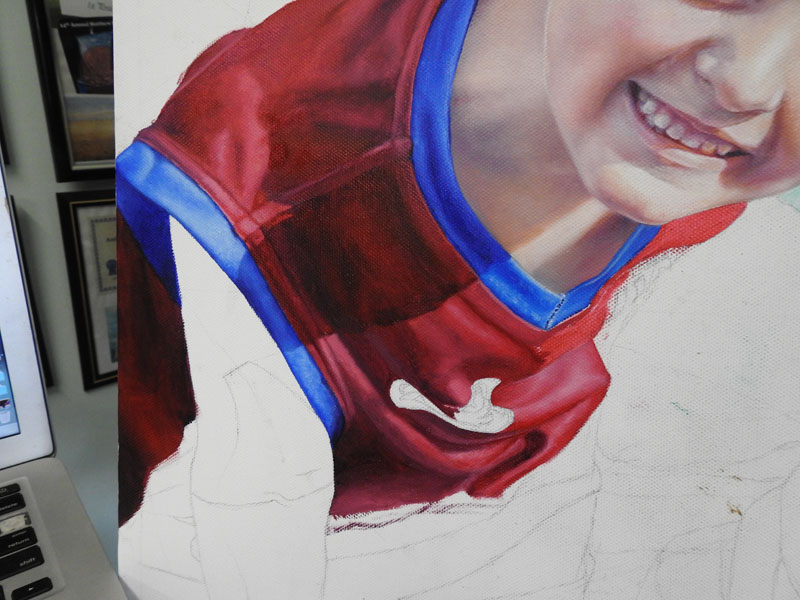
A crease will have a fairly sharp edge, whereas a soft fold will have soft edges. Depending on the size of the fold, the dip between folds will lighten up again as it will attract more light. As the material folds around, the highlight is placed in the middle of the fold so that it appears to project toward the viewer.
Arty
Fact: To make an object (e.g. an
orange) look round, we make it a little bit darker on the sides and underneath
the orange, and lighter in the middle as it comes forward towards you.
No comments:
Post a Comment